Case Study: Habit Hero
Redesigning a Fitness App.

Overview and Impact
Problem
The initial MVP suffered from a confusing layout, and users were for reasons not known were not engaged and motivated to use the app. There was a high risk of a low adoption rate, which could have led to the company failing in its mission of helping individuals become healthier.
My Role
UX Researcher and UI Designer
Year
2024
Tools
Figma, Miro, Paper, Pen
Outcome
The redesigned app led to a sign-up success rate increase from 20% to 90%.
90% task success rate for progress tracking.
User satisfaction for data tracking increased from a 3 to 8.5 (scale 1-10).
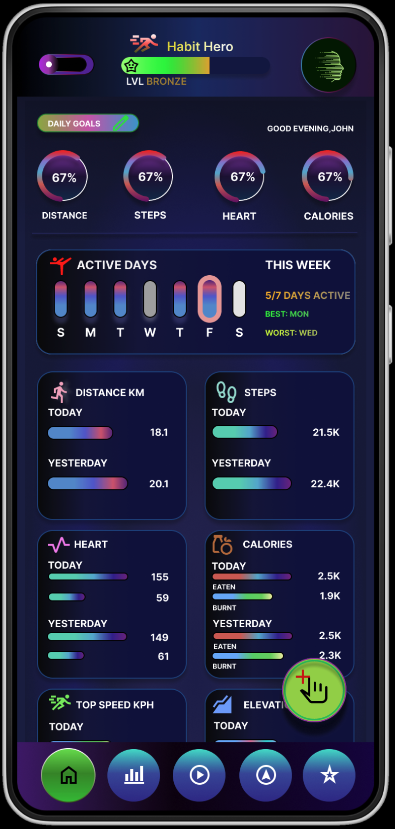
The redesigned home screen, offering users a clear and motivating overview of their progress.
The Problem & The Goal
The Challenge
Users found the app very difficult to navigate. The initial design feedback stated that users were not motivated and engaged. The reasons for the lack of engagement were unknown
Objectives
To understand why users were not motivated and engaged through user research.
Through analysis stage, we understand the design does not adhere to design principles. The structure of the design must be improved.
To ensure that our user-centric goals also meet business goals of improving KPIs: increase user engagement, increase retention, and increase sign-ups. This ensures the company's mission statement is achieved- helping people to become healthier through technology
Discovery and Research
What I did
Based on the initial analysis of the original MVP design, we created hypotheses to test in our user research. The aim was to validate our assumptions. A key assumption was that users were not motivated and engaged to use the app because the data insights and progress tracking were too basic and therefore not useful. This meant users were not engaged and motivated to use the app.
In addition to this, the user research, I also conducted usability testing on the MVP. Through the research, I was hoping to either validate or invalidate my hypothesis and potentially discover more insights.
Key insights
Overall, users did not like the app. There was very little positive feedback on any aspect of the app.
Users struggled with the sign-up process resulting to a 20% sucess rate only.
Users satisfaction for data tracking was only a 3 (scale 1- 10).
Hypthesis Validated
A key hypothesis was validated: Users did not find the data and progress tracking provided by the app to be insightful and useful. This would mean the users would not use the app.
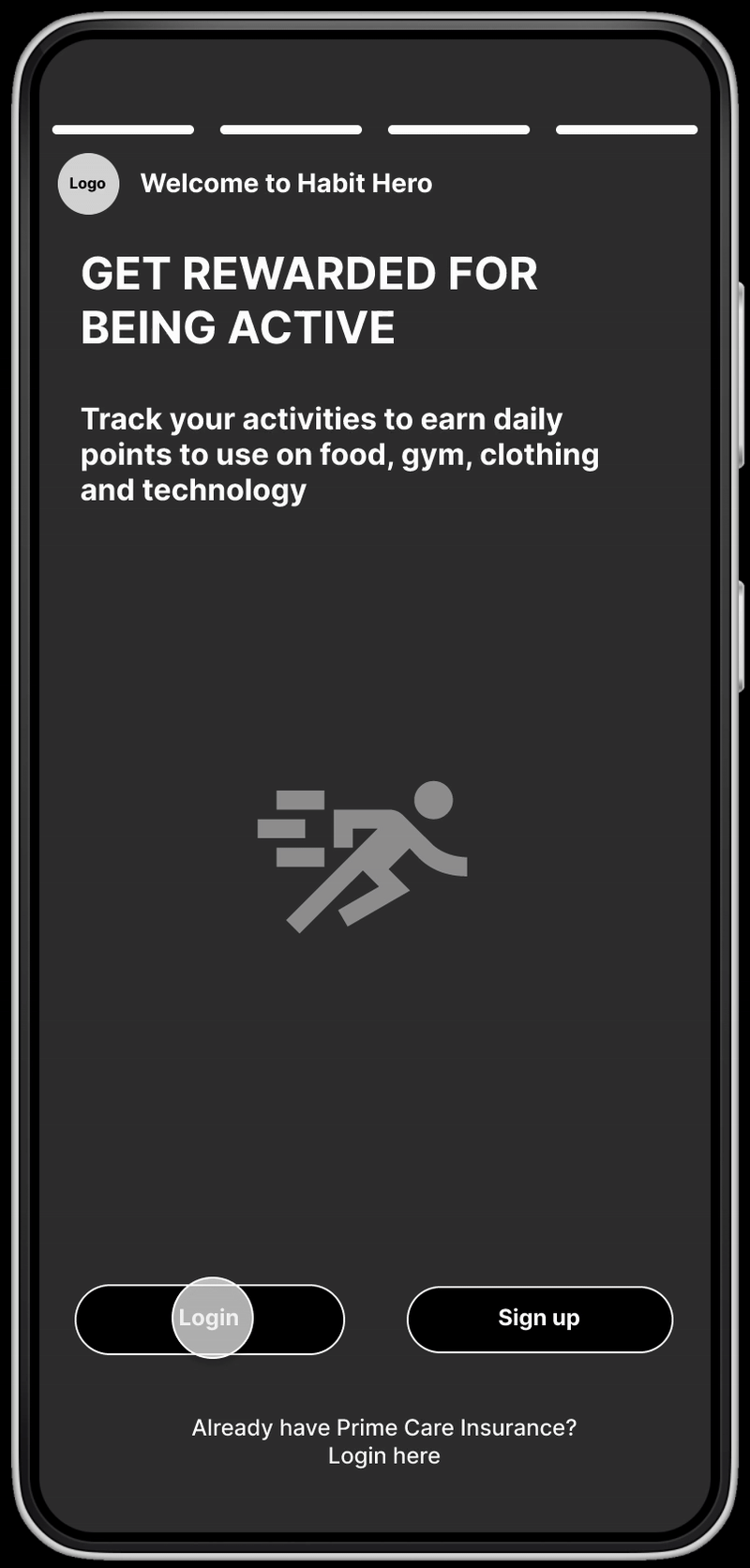
A glimpse of the original app design, which users found confusing and unengaging.
"I prefer an app that adapts to my goals"
"Fitbit provides useful data like my deep sleep pattern"
"The existing app has such basic data that it won't help me in my daily life"
"I'm not sure what to do now"
"I cook with fresh ingredients, adding calories just through scanning the bardcode wouldn't work"
"This app looks like it has malware"
User feedback was synthesized to identify key pain points and validate initial hypotheses about the app's shortcomings.
Definition and Ideation
User Problem
All users tested shared the same belief that the data and progress tracking was too basic. The current lack of detailed and insightful activity data is creating a disengaged user base, leading to low motivation and a direct negative impact on user retention and long-term platform engagement
Ideation
For ideation, I used the How Might We (HMW) methodology.
How can we create data insights that users will find useful?
How can we help users understand their progress better?
What insights will keep users motivated and engaged?
How can we provide the most important data to users?
This ideation session resulted in producing data graphs for different periods for each activity type. This would help users to make sense of their data. It would provide a detailed breakdown and show meaningful and insightful data. Users will also be shown key important metrics on the homepage. The homepage would present crucial data that is readily comprehensible upon a quick examination.
User Flow
A user flow was created to ensure a smooth and efficient path for users to access insight and meaningful data graphs. The previous design lacked an intuitive navigation, so it was important to make a significant design improvement. Once a very efficient path was thought out, I could now start building the wireframes in Figma
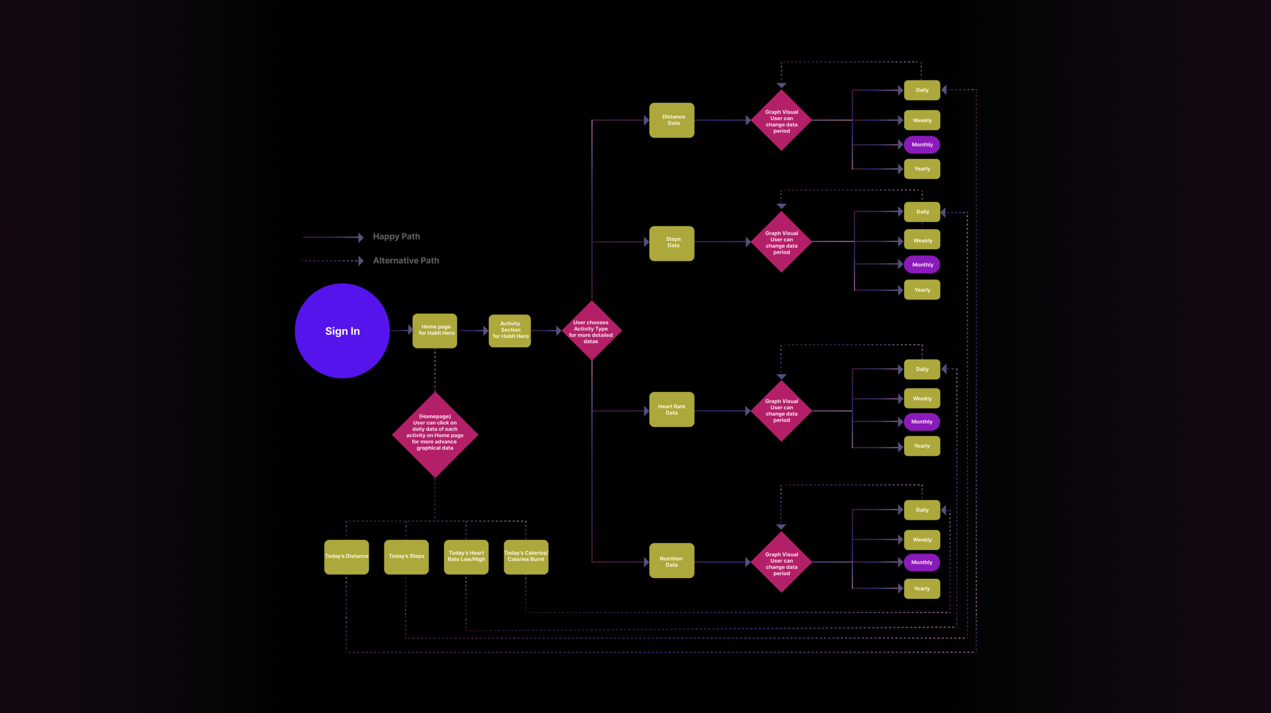
The user flow was mapped out to create a more intuitive and efficient path for tracking progress.
Design and Testing
Mid-Fidelity
I created Mid-Fi wireframes were I refined the design ideas even further and in more detail than the low fidelity sketches. The Mid-Fi provided a more accurate representation of the design. The Mid-Fi were converted to a prototype for usability testing
Usability Testing
The Mid-Fi Prototype were tested for design flaws and usability problems.
Pain Points
Here were some of the main Pain Points identified:
1. The homepage data was overly complex in the initial mid-fidelity. It lacked understandability and needed a clearer structure.
2. The initial graphs weren't understandable and required a better structure.
3. Users clicked the wrong buttons. For example, users could not sign out because they instead clicked a similar-looking icon nearby.
The Pain Points helped to identify design and usability flaws. A new improved design followed after correcting the Pain Points
Mid-fidelity prototypes were created and tested to refine the layout and user interactions.
Hi-Fidelity
Style Guide
A Style Guide was created after rectifying the pain points identified in the Mid-Fi usability testing. A complementary colour scheme, typography and icons were created. I used Google's Materials Design for icons. The inspiration for the colour scheme was, in fact, an out-of-the-blue moment- I had a sudden insight that these colours would look great. I had an original moment of inspiration.
Hi-Fi Prototype
The style guide was used to direct and create a consistent style.
Design Hand-Off
I prepared the files for developers. Details such as spacing, colours and interaction details were included.
The final high-fidelity prototype, incorporating the new style guide and addressing usability issues.
Impact and Lessons
Impact and Results
The final design was a significant success, directly addressing the core problems of low engagement and poor usability identified in the research phase. By focusing on providing clear, insightful data and a streamlined user experience, we achieved the following measurable improvements:
• Sign-up success rate increased from 20% to 90%, indicating that the redesigned onboarding flow was significantly more intuitive.
• A 90% task success rate was achieved for progress tracking, validating the new, simplified navigation and data presentation.
• User satisfaction for data tracking soared from 3/10 to 8.5/10, confirming that users found the new data visualizations both useful and motivating.
Lessons
I was overly ambitious in my ideas and solutions during the ideation stage. This created a greater workload. I tried to add new features rather than focusing on only one. In the future, I should prioritise one major idea that would have the most impact and is most urgent. I could use the Eisenhower Matrix to prioritise what change is most needed.

The redesign resulted in a more engaging and effective fitness tracking experience.