Case Study: The Wall Street Journal
Guerrilla Research for a New Feature

Overview and Impact
Problem
As a long-term WSJ reader, I was annoyed that the app did not have the functionality to make comments on the article. I believed many other users felt this was a major issue. My assumption required quick validation through Guerrilla Research.
My Role
UX Designer
Year
2025
Tools
Miro, Paper-Prototypes, Pen
Outcome
In 3 days we gathered enough information to validate our assumptions, and understand the user needs, to guide our design of the comment feature.
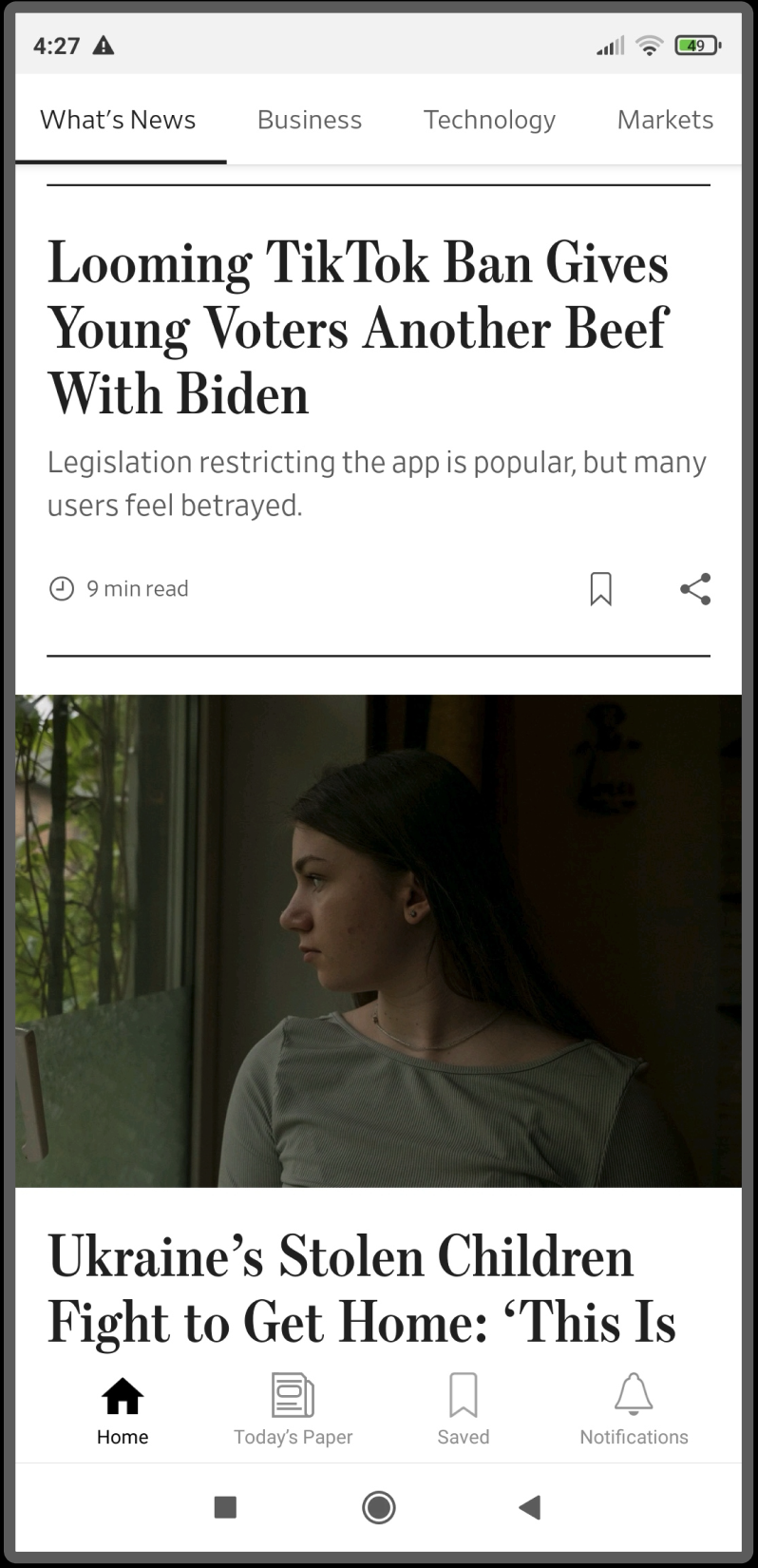
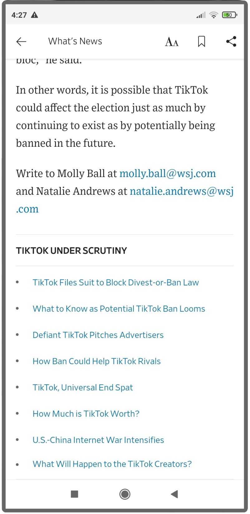
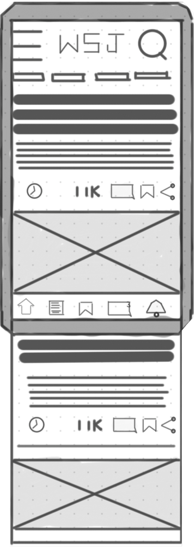
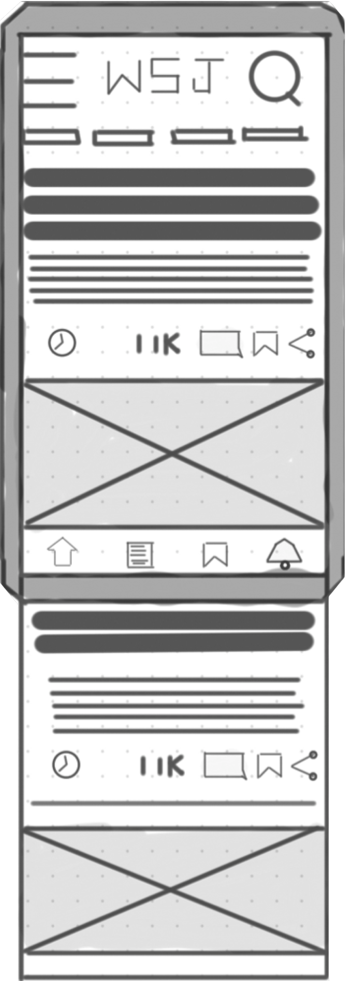
| The current WSJ App
Introduction & Problem
The WSJ
The Wall Street Journal is a popular newspaper and is renowned for its trustworthy and informative articles.
Identifying the Gap
As a dedicated reader, I observed that the mobile app lacked a key feature to improve user engagement. The ability to comment on articles and reply to user would be a major benefit to both the user and the WSJ. The users will be happy and the WSJ would have increase user engagement.
Goal
To use Guerrilla Research to quickly gather enough information to validate my assumptions that a commenting feature would increase user motivation and engagement to use the app more. This would be measured by increase in the following metrics:
- Frequency of visits: how often users open the app (Daily Active Users/MAU)
- Session Duration: The length of time users spend in the app per session
- Time on Article: The amount of time spent on a specific article page
- Article Views: the number of articles a user opens.
- No user complaining about the Lack of Comment Feature on Google App Reviews.
Discovery and Research
Initial observation & Competitive Analysis
I observed and analysed other popular News Apps that have Comment Features including: The Guardian, The Telegraph, The BBC, and also checked the WSJ website comment section. The analysis helped to idenitfy the weaknesses and strengths of each App's commenting section.
I also checked Google Reviews to understand what users were most complaining about. I noted that the most frequent negative review was about the lack of a comment feature or the ability to listen to articles. Google Reviews is a form of secondary research/desk research, whereas Guerilla Research is primary research. Primary research is direct contact with actual users and observing their behaviour with the app and asking them direct questions.
Guerrilla Research
We conducted user interviews and A/B testing to validate our assumptions.
| Goal | To understand why users use the comment section in a newspaper and what makes a good comment section. By interviewing the relevant users, we can create a comment functionality section that meets the user needs. |
|---|---|
| Questions |
|
| Task |
A/B Testing WSJ Mobile site (can comment on articles) vs WSJ App (can’t comment on articles) What are your first impressions of WSJ |
| Users |
Sample size - 4 Duration - 15 mins |
Research Findings
- They enjoy discovering new perspectives
- Users want to express their opinions
- Users enjoy interacting with other users
- Users like to receive notifications of other users liking or replying to their comments
| Identifying Potential Improvements
"The BBC News has a comment section I use"
"The App is basic- you can't listen whereas the other one you can"
"A news app with a comment section is a better experience. You feel more engaged"
"I like to read the comment section. I feel part of the conversation"
"You can't comment on the App"
"I enjoy sharing my point of view on topics I'm interested in"
"I get a thrill, the more likes I get"
"I like to track if anyone is engaging with my comment"
| Common Feedback from Guerrilla Research
User Personas & JTBD
User Persona
To ensure our design decisions were grounded in user needs, we synthesized our research into a User Persona. This artifact captured the key goals, frustrations, and motivations of our target audience, serving as our guide throughout the ideation phase.
Jobs-to-be-Done (JTBD) Framework
To translate our research findings into a clear design direction, we applied the Jobs-to-be-Done (JTBD) framework. This allowed us to pinpoint the core motivations behind why users engage with the app, ensuring our design solutions directly addressed their true needs.
- When [WSJ issues an article], users [want to comment on the article] so they can [express their viewpoint, hopefully other users agree with their viewpoint through likes or a positive reply]
- When [WSJ issues an article] users [want to read other users’ comments] so they [can understand what other similar-minded users think about the topic]
Definition and Ideation
User Problem
A thoughtful WSJ needs a clear way to share their viewpoints and understand other readers' opinions on an article because the current inability to see different perspectives on articles makes their reading experience less engaging and one-sided.
To directly address the user's needs for a more engaging, multi-perspective reading experience, I focused on three key design decisions.
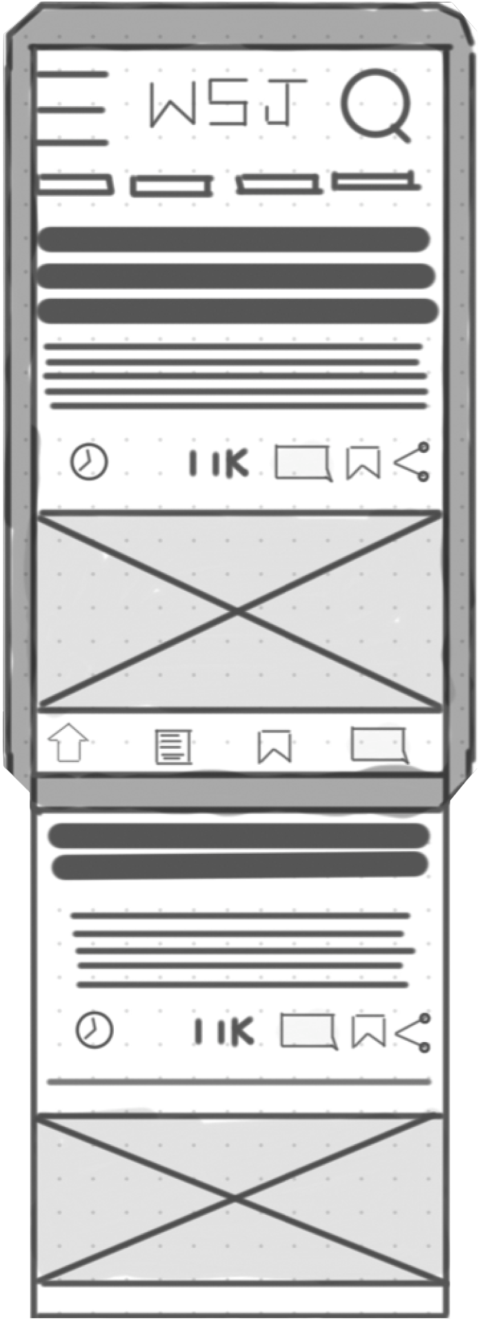
Ideation
This led us to sketch multiple concepts for an immersive and captivating commenting experience.
Design Decisions
Based on our research findings, we designed the following features:
- Users enjoy expressing their viewpoint. So any article that has a comment section will be displayed with a comment icon.
- Users enjoy discovering new perspectives. The comment section will allow users to like other users' comments and reply.
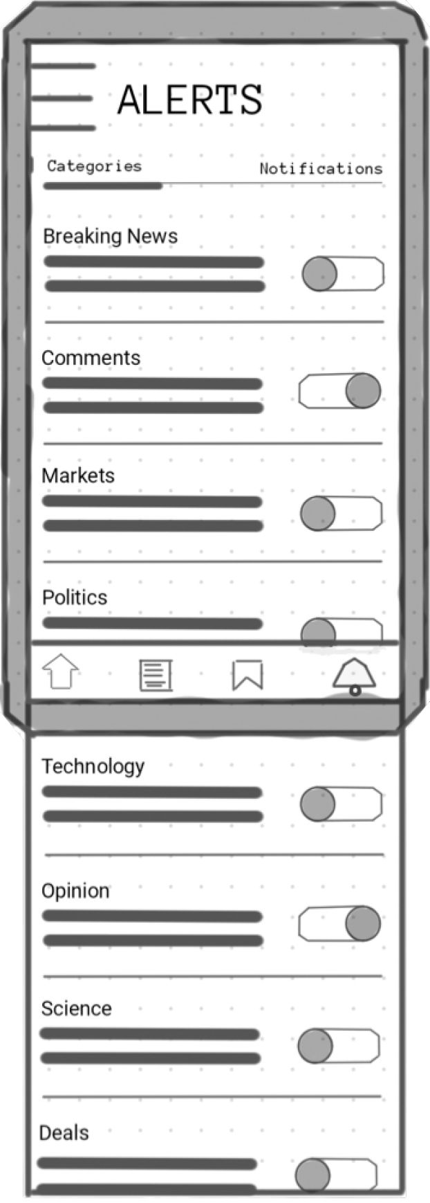
- Users like to receive feedback on any likes or replies to their comments. We have designed a notification system that allows users to keep track of comment status.
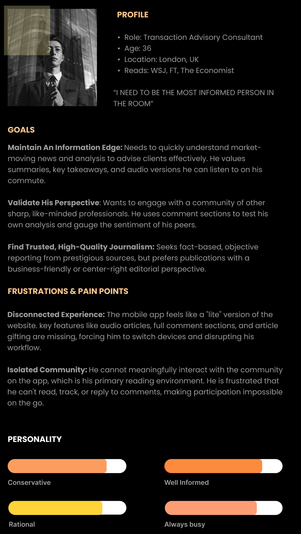
| User Persona

| Sketching a comment section based on the research findings
User Insight: This was driven by users saying, "I like to track if anyone is engaging with my comment."
Outcome: I discarded this idea. A separate icon for comments was redundant. I learned that a single, unified notification system would be a clearer and more efficient solution for the user.
| Home Sketch Idea 1
User Insight: This was driven by users saying, "I like to track if anyone is engaging with my comment."
Outcome: I discarded this idea. A separate icon for comments and alerts was redundant. I learned that a single, unified notification system would be a clearer and more efficient solution for the user.
| Home Sketch Idea 2
User Insight: This was driven by users saying, "I like to track if anyone is engaging with my comment."
Outcome: This approach was selected. A single alert icon successfully unified all notifications, creating a clearer, more efficient experience that solved the user's need without cluttering the interface.
| Home Sketch Idea 3
User Insight: This was driven by users stating, "A news app with a comment section is a better experience."
Outcome: This idea was discarded. Having a message icon in the main navigation and a different comment icon within the article was confusing. It created redundancy and cognitive load for the user.
| Article Idea 1
User Insight: This continued to address the core user need for an engaging experience, as one user put it, "A news app with a comment section is a better experience."
Outcome: This version was selected. By using a single, clear comment icon in the article and relying on a dedicated alerts icon in the navigation, the layout became much more intuitive and aligned with common design patterns.
| Article Idea 2
User Insight: This was driven by multiple users stating, "I enjoy sharing my point of view" and "I like to read the comment section."
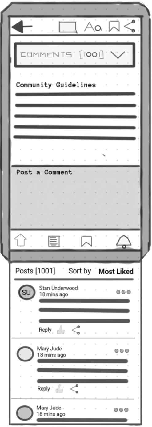
Outcome: This idea was not selected because it was too basic. It lacked a clear way to handle replies and only allowed sorting by 'Most Likes,' which could alienate users. I learned that robust sorting and reply functionality were crucial for fostering a true community conversation.
| Commenting Sketch 1
User Insight: This directly addressed user feedback such as, "I get a thrill, the more likes I get."
Outcome: While adding 'likes' was a step forward, this concept was also discarded. It still suffered from the same core issues as the first sketch: no clear system for replies and a restrictive sorting feature. This reinforced the need for a more comprehensive design.
| Commenting Sketch 2
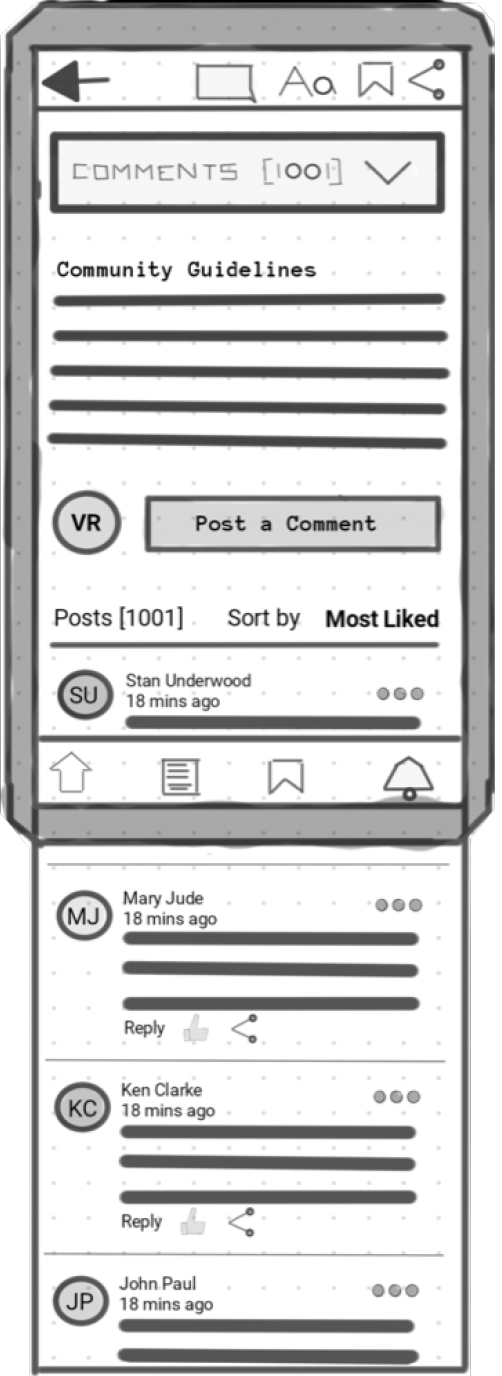
User Insight: This directly addressed the need for users to feel part of a conversation, as they mentioned wanting to "read the comment section" and "share their point of view."
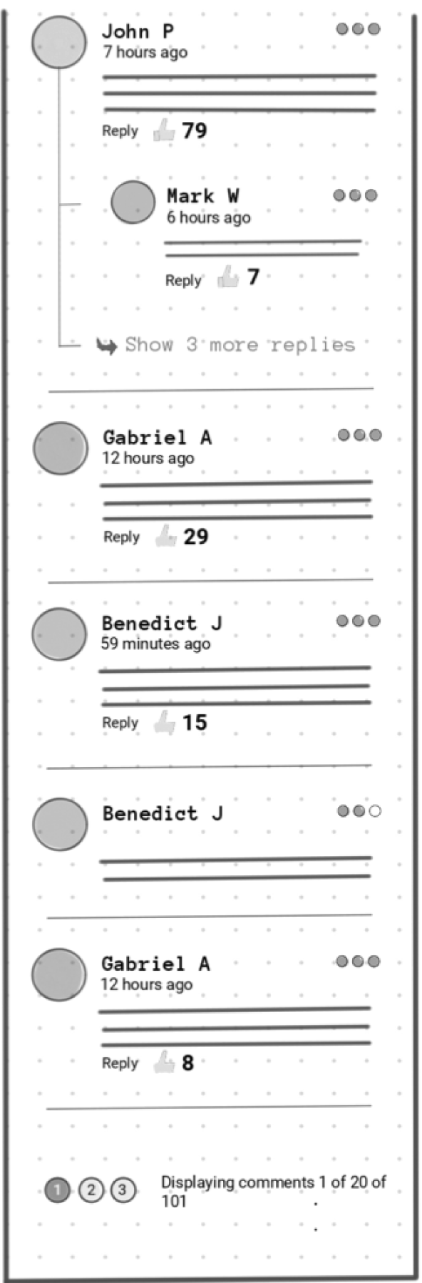
Outcome: This was a significant improvement. The addition of replies created a more dynamic and engaging structure, moving closer to the goal of a community-driven experience.
| Commenting Sketch B1
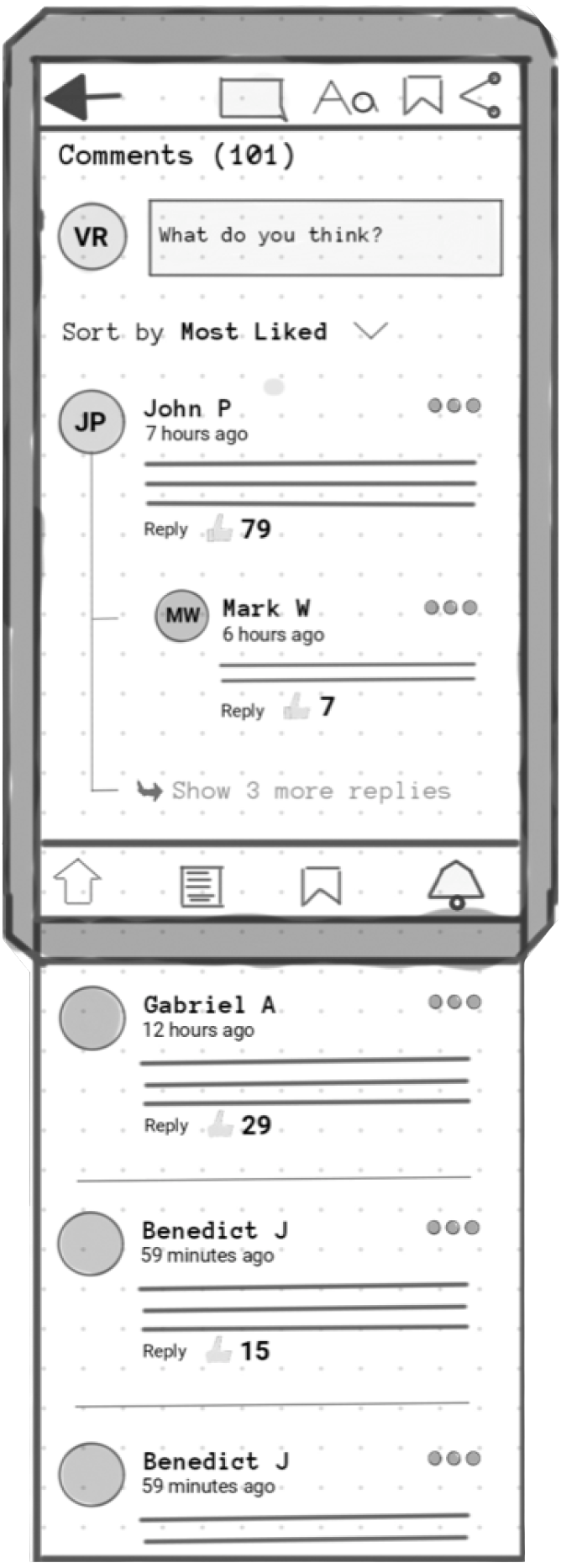
User Insight: This was designed for the "power reader" who, as one user put it, wants to "feel part of the conversation" by reading many different viewpoints.
Outcome: This detailed view confirmed that the layout was scalable and remained readable even with a large number of comments, which was a key consideration for a high-traffic news app.
| Commenting Sketch B2
User Insight: This addressed the limitation of previous sketches and ensured all users could feel part of the conversation, not just those with the most popular comments.
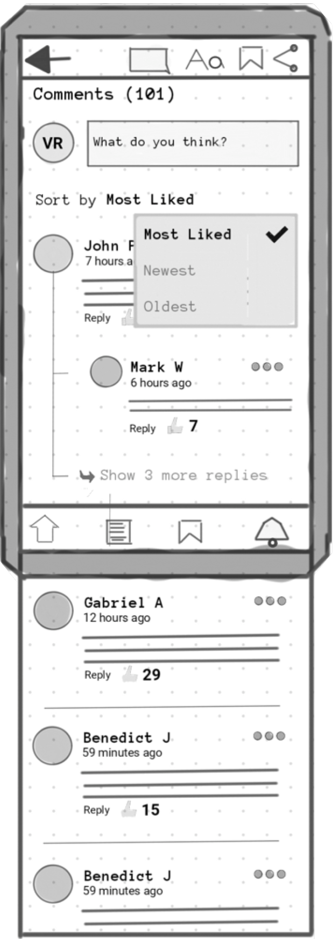
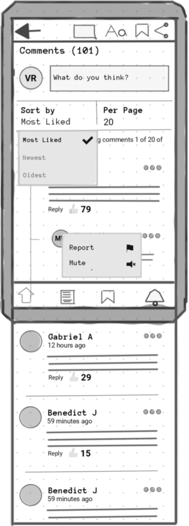
Outcome: This was a critical addition. Providing multiple sorting options empowers the user to engage with the content on their own terms, which was a key learning from the initial, more restrictive sketches.
| Commenting Sketch B3
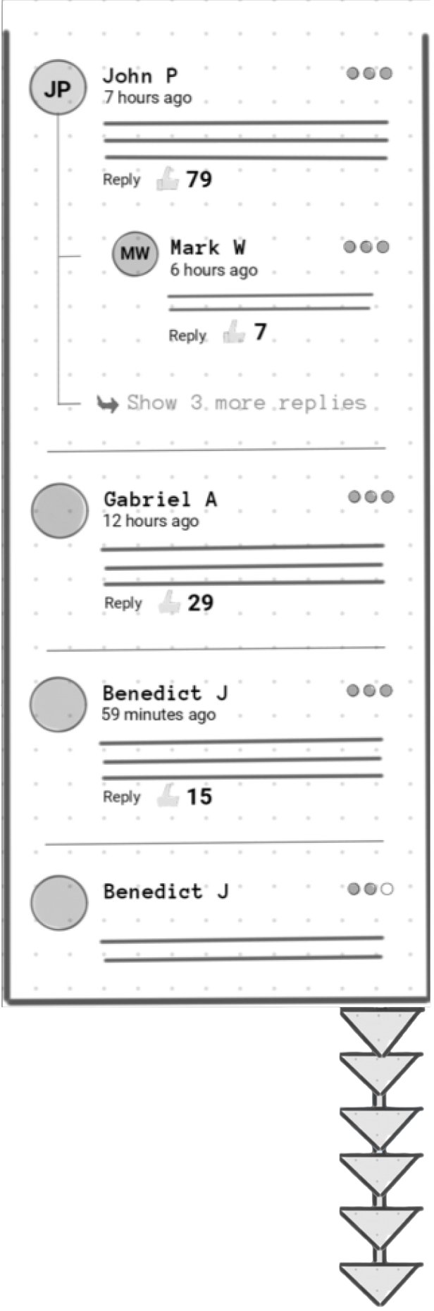
User Insight: This addresses the core desire to read many comments without the fatigue of endless scrolling.
Outcome: This sketch was selected for its balanced approach. It retained the strong conversational structure of the 'B' series while adding crucial navigation tools, creating a better reading experience for users who like to dive deep into comments.
| Commenting Sketch C1
User Insight: This design helps users who "feel part of the conversation" by giving them a clear sense of place and progress within a long discussion.
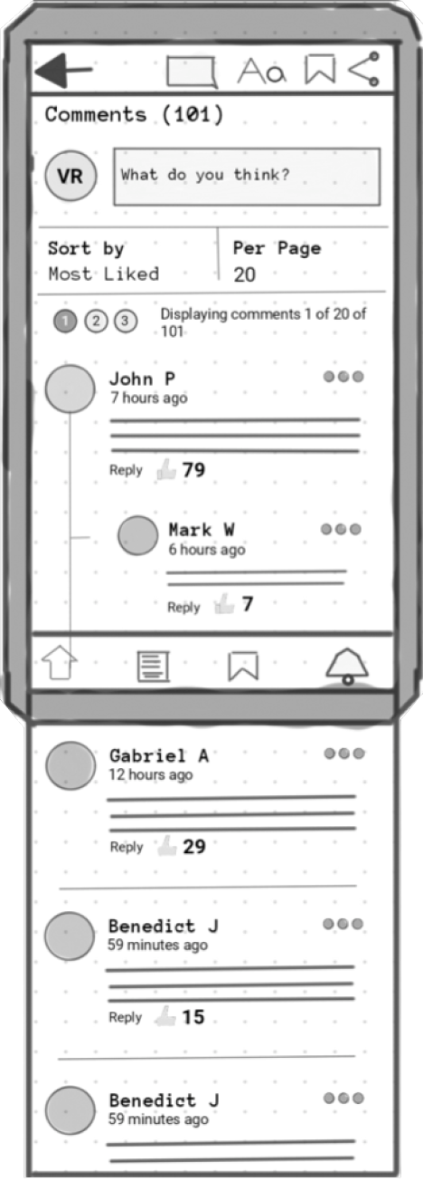
Outcome: This was a successful visualization. Showing the current page number and the total number of comments prevents user fatigue and provides a sense of control, which is essential for a positive user experience.
| Commenting Sketch C2
User Insight: This directly addresses the user's desire to both read many comments and discover the most popular ones, as one user said they "get a thrill, the more likes I get."
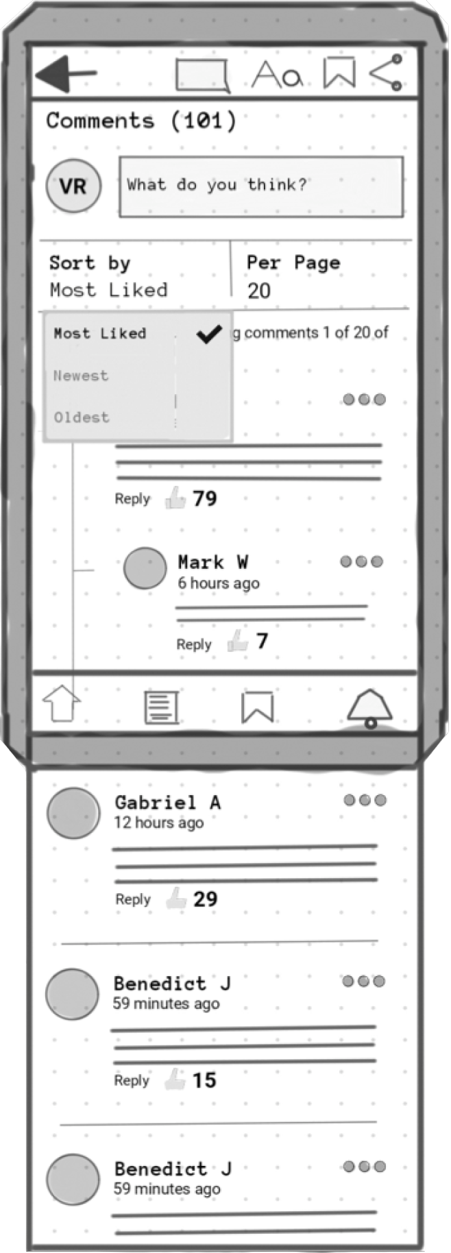
Outcome: This combination was selected as the final direction. It provides a powerful, user-centric reading experience by allowing users to tailor the comment section to their specific reading style.
| Commenting Sketch C3
User Insight: While not a direct quote, the need for a positive community space is a foundational principle of social features. Disrespectful users can ruin the experience for everyone.
Outcome: This was identified as a critical feature for launch. To ensure the comment section remains a place for healthy conversation, empowering users with moderation tools is essential for long-term community engagement and safety.
| Commenting Sketch C4
User Insight: This addresses the user's need to "track if anyone is engaging with my comment."
Outcome: This version was not selected. While functional, showing the full text of each comment made the list feel cluttered and hard to scan quickly.
| Notification Sketch 1
User Insight: This still serves the need to track engagement, but in a more streamlined way.
Outcome: This sketch was selected. By showing only the article title and a snippet of the comment, the list is much easier to scan. Tapping an entry takes the user directly to their specific comment within the article, providing a more efficient workflow.
| Notification Sketch 2
User Insight: This caters to both users who "get a thrill" from likes and those who might find constant notifications overwhelming.
Outcome: This was deemed an essential feature. Giving users control over notifications is crucial for a positive experience and prevents the feature from becoming intrusive.
| Notification Sketch 3
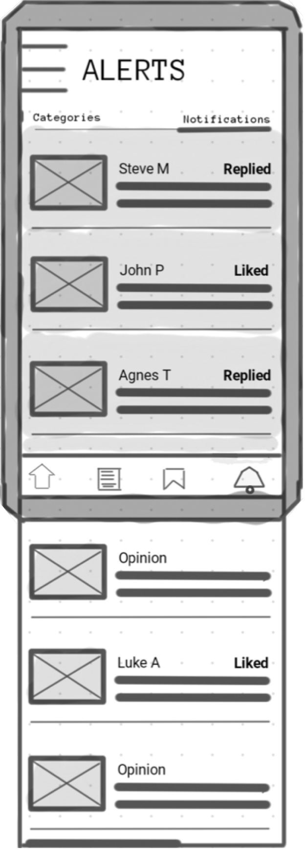
User Insight: This design directly serves multiple user needs: tracking engagement, feeling part of the conversation, and easily re-engaging with threads.
Outcome: This sketch was selected as the final direction for the notification center. It provides a clear, actionable feed that allows users to see who has interacted with their comments and reply directly, fostering a sense of an active and connected community.
| Notification Sketch 4
User Insight: This directly addressed the need for users to feel part of a conversation, as they mentioned wanting to "read the comment section" and "share their point of view."
Outcome: This was a significant improvement. The addition of replies created a more dynamic and engaging structure, moving closer to the goal of a community-driven experience.
| Comment Thread Sketch
User Insight: This addressed the limitation of previous sketches and ensured all users could feel part of the conversation, not just those with the most popular comments.
Outcome: This was a critical addition. Providing multiple sorting options empowers the user to engage with the content on their own terms, which was a key learning from the initial, more restrictive sketches.
| Comment Sorting Sketch
User Insight: This addresses the core desire to read many comments without the fatigue of endless scrolling.
Outcome: This sketch was selected for its balanced approach. It retained the strong conversational structure of the 'B' series while adding crucial navigation tools, creating a better reading experience for users who like to dive deep into comments.
| Pagination Sketch
User Insight: This design helps users who "feel part of the conversation" by giving them a clear sense of place and progress within a long discussion.
Outcome: This was a successful visualization. Showing the current page number and the total number of comments prevents user fatigue and provides a sense of control, which is essential for a positive user experience.
| Pagination Controls
User Insight: This directly addresses the user's desire to both read many comments and discover the most popular ones, as one user said they "get a thrill, the more likes I get."
Outcome: This combination was selected as the final direction. It provides a powerful, user-centric reading experience by allowing users to tailor the comment section to their specific reading style.
| Combined Sorting & Filters
User Insight: While not a direct quote, the need for a positive community space is a foundational principle of social features. Disrespectful users can ruin the experience for everyone.
Outcome: This was identified as a critical feature for launch. To ensure the comment section remains a place for healthy conversation, empowering users with moderation tools is essential for long-term community engagement and safety.
| Moderation Tools
User Insight: This caters to both users who "get a thrill" from likes and those who might find constant notifications overwhelming.
Outcome: This was deemed an essential feature. Giving users control over notifications is crucial for a positive experience and prevents the feature from becoming intrusive.
| Notification Settings
User Insight: This design directly serves multiple user needs: tracking engagement, feeling part of the conversation, and easily re-engaging with threads.
Outcome: This sketch was selected as the final direction for the notification center. It provides a clear, actionable feed that allows users to see who has interacted with their comments and reply directly, fostering a sense of an active and connected community.
| Notification Feed
Conclusion & Next Steps
Recap
This case shows the quick value of targeted Guerrilla Research to gather enough information to validate our assumptions and guide the design direction.
Impact
The comment feature was clearly a feature that users wanted through the user research. Adding the comment feature will allow users to interact with content and other users. This social interaction will transform the app into an active community where like-minded people share their thoughts on various topics. A successful implementation would be a 15% increase in session duration and a 10% increase in daily active users within the first three months.
Future Improvements
A more well-refined notification system can be implemented. I did not go into too much detail in iterating the notification system. The main purpose of the ideation was to focus on the commenting experience within the articles themselves. Focusing on the commenting section would create an active community of like-minded individuals engaging with the articles.
At a later date, we would conduct further usability testing on the commenting design. This would help us to iron out any remaining pain points in the user flow.

| My final thoughts